 Curator
14 August, 2026
Curator
14 August, 2026
self-taught graphic designer roadmap: How to Use the Right Colors
Hello everyone, I'm Desinique.If you're looking for fancy effects and complex synthesis, I'm not your pitch. But if you want to create practical, commercial designs using just 1/3 of the simplest tools—and build your ultimate survival skill—that's my specialty. We previously covered the 5 essential detail rules, color blocking principles, product image guidelines, and background design. Now that you understand these core design fundamentals and how color drives visual hierarchy, let’s dive deeper into the next step on your self-taught graphic designer roadmap.
To me, graphic design is simply about "using the right colors." When I choose colors, I focus on just two core principles—simple, yet highly practical.
1. Start from the brand or theme Technology: Blue — professional, trustworthy Eco / Environment: Green — natural, sustainable Festive / Celebrations: Red — passionate, energetic
2. Eyedropper / Sample colors directly from the image When a design has a primary image, I almost always sample colors straight from the photo. Making the text and background match the image naturally unifies the overall look.
My personal rule of thumb: The Rule of Three No more than 3 distinct hues (different colors) in a single design. Black, white, and gray don't count toward this limit.
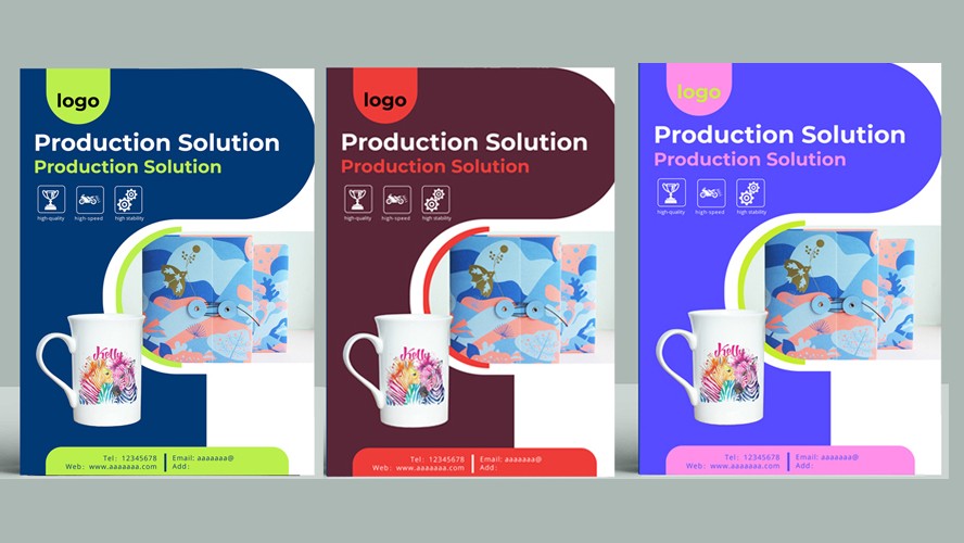
Create depth using Brightness & Saturation Within the same color, adjusting it lighter, darker, more vibrant, or muted creates rich depth without adding unnecessary colors.
Speaking from the heart: Graphic design is my "lazy man's" gentle sanctuary Moving past the practical side, I’d like to speak honestly. I’m 42 this year, but inside, I still feel like a kid who just loves sitting at a desk. I’m lazy and don’t consider myself to have any special talents, yet I’ve made it this far relying entirely on this one self-taught trade.
Popular