 Curator
5 August, 2026
Curator
5 August, 2026
self-taught graphic designer roadmap | Very Flat Graphic Design | Desinique
My design style has always been flat, with no flashy effects. This strictly flat style graphic design has sustained me for nearly 20 years. Let me break this down in detail.
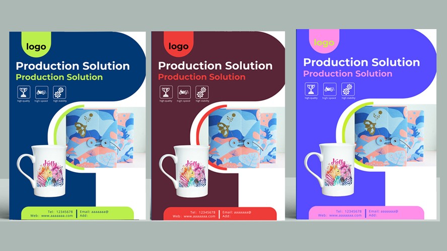
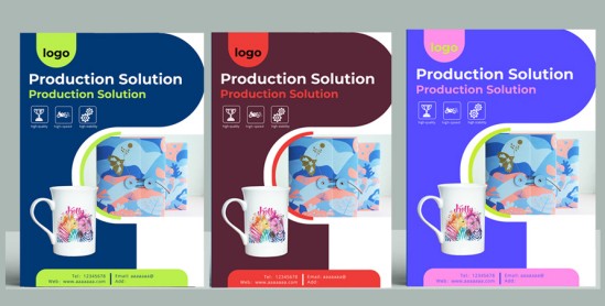
1. Mastering Decorative Color Blocks Decorative color blocks cover many forms: background blocks for headlines, decorative line blocks, combined graphic blocks, background blocks for product displays, and negative space assisted color blocks.
They follow this creative flow: Logical hierarchy: Move from the fundamental functions of color blocks, through detail refinement and creative combinations, and finally onto color application. This mirrors the real world design workflow, from foundational basics to advanced creative work. Value elevation: Take the practice of “mastering color blocks” further to emotional expression. This gives designs deeper meaning and keeps work from feeling purely tool driven.
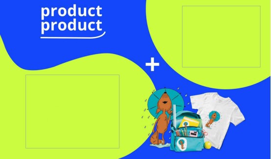
2. Focusing on Subtle Details Details come in many forms: well executed color palettes, smart font pairing, polished edges and corners, well judged subtle accents, and well applied small icons that double as visual highlights. Color pairing: Clear primary hue, harmonious secondary colors, and accent colors that draw focal attention. Font pairing: Well matched headline and body copy, comfortable point size and leading, and font weight used to guide visual hierarchy. Edge and corner refinement: Precise alignment, consistent spacing, eliminating visual “visual noise” or jagged artifacts. Subtle accents: Purposeful, theme driven, never overpowering the core message. Icons: Simple, recognizable, stylistically consistent, serving as visual highlights.
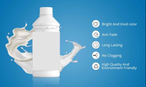
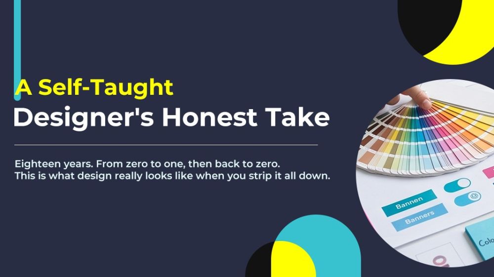
3. Picking the Right Colors My color selection mainly draws from two sources: Based on brand identity or project theme. Tech focused projects often lean on blue to convey professionalism and trust. Sustainability themed work uses green to evoke nature and environmental stewardship. Festive contexts call for red to communicate warmth and energy. Extracted from source imagery: When artwork includes photography or main subject images, I reference the dominant hues within those visuals. This aligns text, backgrounds and other elements to build a cohesive color system — this is one of my go to workflows. Note: The largest area color is not always your primary visual color. Colors with high saturation or high contrast grab viewer attention and often function as the de facto main visual hue. Follow the rule of three hues maximum: Limit distinct hues in one layout to no more than three: primary, secondary, and accent. Whites, blacks, and grays do not count toward this hue limit. Build depth with brightness and saturation: Within a single hue, adjust brightness and saturation to create rich visual layers without introducing additional new hues.
That wraps up my rational takeaways from self taught graphic design. Now let’s talk about this from a more personal, emotional perspective. I am someone who loves office based desk work, even at age 42. This industry fits my needs perfectly. I am lazy, and that is pretty much my only defining trait. I learned this set of skills and built my career with them. I get weekends off, 9 to 5 hours, a two hour lunch break, zero overtime, and I never get work messages on my days off. I could earn more money, yet I choose not to. I value extra time with my spouse and children. This lazy designer’s approach covers all my basic living needs, and I am deeply grateful for that. For anyone thinking about teaching themselves graphic design: have you started your journey yet?
Popular