 Curator
26 August, 2026
Curator
26 August, 2026
Self-Taught Color Theory for Beginners: High-End Poster Colors
When beginners first dive into Adobe Photoshop, the hardest hurdle usually isn’t extracting subjects or making selections—it’s picking colors that actually work together. Adding too many shades can quickly make an entire layout look cheap and cluttered.
By applying the Unique Color Method—a self-taught framework developed through hands-on design practice—you can create high-end, professional commercial posters using just a single base hue.
What Is High-End Monochromatic Color Design?
At its core, a monochromatic color scheme means locking in one base hue and varying only its brightness and saturation. Instead of getting lost in complex color wheel theories, follow this straightforward, three-step workflow:
1. Anchor the base with deep tones: Use a high-saturation or low-brightness base (such as deep purple) across the main background to immediately give the composition visual weight and depth. 2. Build hierarchy with distinct brightness levels: Pull lighter values from the same hue family (like soft lavender) for your headline, key subjects, and accent stripes. Keep at least a 30% contrast gap between your text and background to ensure crisp legibility. 3. Introduce neutral whites and grays for breathing room: Incorporate pure white and subtle light gray shapes (such as background card containers or logo badges) to break up the color density and create natural negative space.
Step-by-Step Breakdown: The Purple Poster Color Logic
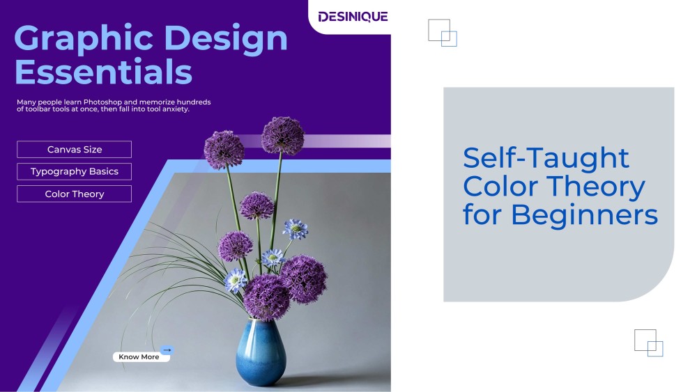
In this minimalist poster example, the entire visual hierarchy is built on a precise monochromatic structure:
1.Dominant base (Deep Purple background): Sets a sleek, modern, and artistic tone while grounding the canvas. 2.Tonal highlights (Headlines and Florals): The primary headline and floral clusters use mid-to-high brightness lavender shades to pop cleanly off the dark background. 3.Neutral transition (Light Gray diagonal block): A large angled shape in the lower-right cradles the vase, creating a smooth visual bridge between the dark background and the light subject. 4.Analogous accents (Icy Blue vase and CTA button): A touch of cool cyan-blue is introduced on the vase and the bottom-left CTA button. As an analogous neighbor to purple, it draws the eye straight to the focal point without breaking color harmony.
Why Beginners Should Start with Monochromatic Color Schemes
Mixing multiple random colors is a fast track to visual clutter. The Unique Color Method delivers an instantly unified brand feel.
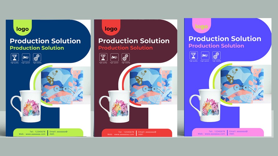
Even better, it streamlines client proposals: simply place a Hue/Saturation Adjustment Layer at the top of your Layers Panel, drag the Hue slider, and you can instantly generate purple, green, blue, or warm orange variations in seconds.
Once you master this self-taught approach, you can stop guessing and start creating clean, balanced, and high-impact original designs.
Popular