 Curator
17 September, 2026
Curator
17 September, 2026
Practical 1/3 Method for Photoshop Beginners: Can Color Grading Be This Easy?
When first diving into photo editing, it is easy to get hit with serious Photoshop tool anxiety. Staring at dense menus and dozens of panels can feel overwhelming. The truth is, commercial design does not require memorizing every single dial and slider.
The real secret lies in what I always call the practical 1/3 method for photoshop beginners. Master the core 1/3 of the tools you reach for daily, and you can easily tackle 90% of real-world commercial design tasks.
Across e-commerce and advertising, the most frequent requests you will face come down to two things: changing colors and balancing light and shadow. Getting comfortable with essential photoshop tools for product retouching and setting up a nondestructive editing workflow does more than keep your products from looking cheap or plasticky. It gives you the flexibility to handle endless client revisions without breaking a sweat.
Let's walk through one of the most classic client briefs in commercial retouching and put this high-end recoloring technique into action step by step.
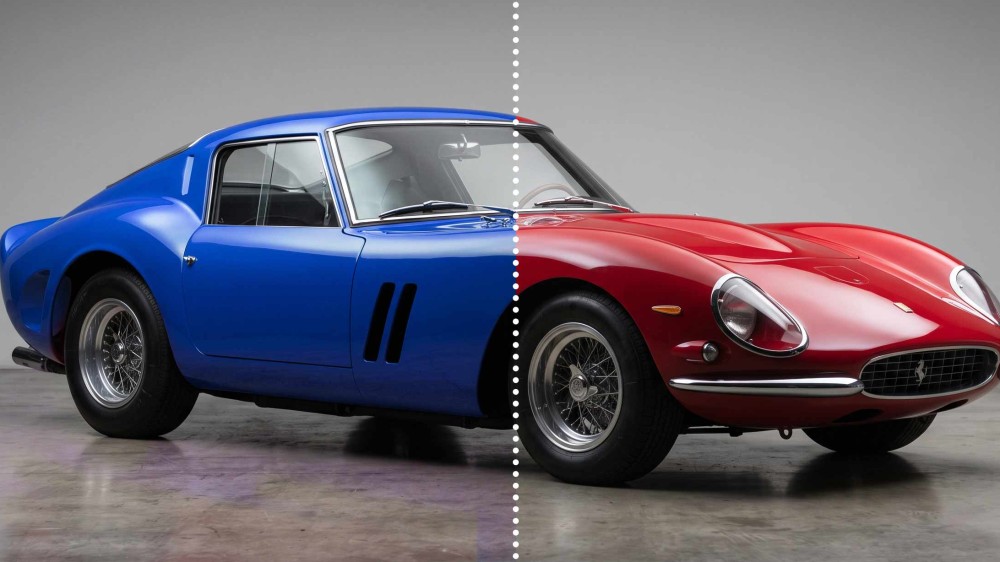
Hands-On Walkthrough: Turning a Red Car Blue
Let's ground this in a real client scenario: the client sends over a single photo of a red car and needs it turned into a natural, believable blue fast. Here is the exact workflow:
Step 1: Shift the Base Color
First, head over to the Adjustments panel on the right and create a Hue/Saturation adjustment layer. Look at the top-left corner of the Properties panel and click the Targeted Adjustment Tool (the small hand icon). Sample the red directly from the car body.
Once sampled, drag the Hue slider over toward the blue range. The car turns blue right away, but notice the problem: parts of the wheels and tires turned blue as well.
To fix this, click the white Layer Mask thumbnail that comes with the adjustment layer. Press B to grab the Brush Tool, make sure your Foreground Color is set to black, and paint over the tires and wheels. This masks out the adjustment and restores their original neutral color.
Step 2: Rebalance Tonal Depth
Take a closer look at the blue paint right now. Notice how it feels slightly washed out and lacks the grounded weight of the original red? That happens because shifting hues often disrupts the original tonal balance.
To bring that weight back, add a Levels adjustment layer right above your Hue/Saturation layer. In the Levels panel, find the black slider on the far left beneath the Input Levels histogram. Drag it slightly inward to the right. This compresses the shadows, deepens the blacks, and restores the solid, grounded presence lost during the color shift.
Step 3: Sculpt the High-End Texture
Now for the final step that sells the realism: polishing the finish. Add a Curves adjustment layer at the very top of your layer stack.
Using the technique we covered earlier, dial in a subtle S-curve. Lift the highlights just a touch in the upper-right section, and gently pull down the shadows in the lower-left section. This stretches the dynamic range between the crisp reflections on the clear coat and the deep cast shadows beneath the chassis.
Step back and look at the final before-and-after comparison on your screen.
We did not touch or destroy a single pixel on the original background image. The specular highlights stay clean and bright, the shadow core remains grounded, and the metallic automotive clear coat looks completely authentic.
Best of all, if your client calls back asking for an emerald green version instead, you never have to start over. Simply double-click the Hue/Saturation thumbnail, drag the slider to green, and you are ready to deliver in seconds.
Popular