 Curator
20 August, 2026
Curator
20 August, 2026
Stop Tool Anxiety: The Practical 1/3 Method for Photoshop Beginners
Hey everyone, Disinique here!
For many beginners stepping into graphic design, the biggest roadblock isn't a lack of creativity—it's the overwhelming feeling of staring at the complex Photoshop interface. Too many learners try to memorize hundreds of toolbar functions all at once, only to spiral into tool anxiety.
Here is the truth: creating commercial-grade designs doesn't require you to master every single tool in the software. In this guide, I will share the practical 1/3 method for photoshop beginners. By focusing on a core set of key tools and pairing them with strong layout logic, you can efficiently create stunning, minimalist social media graphic design tailored to international aesthetics.
Today, we will break down a commercial poster tailored for Pinterest and Instagram to showcase the practical workflow of essential photoshop tools for poster design and help you build a portfolio-worthy social media design.
1. Design Composition & Visual Hierarchy
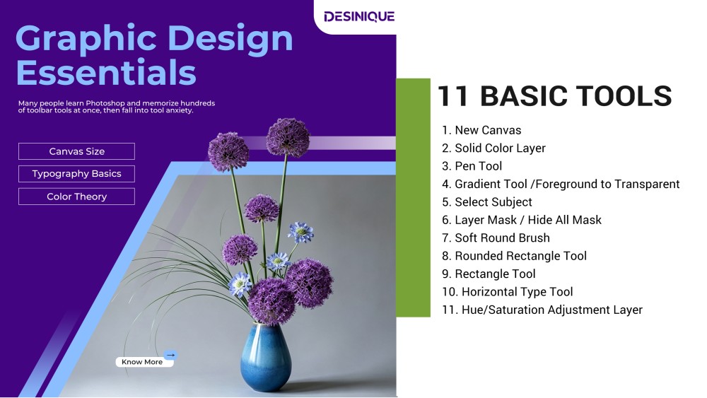
Before jumping into software execution, let's establish the project copy and layout framework: Information Hierarchy: Headline: Graphic Design Essentials (Bold, minimalist typography as the visual anchor) Body Copy: Many people learn Photoshop and memorize hundreds of toolbar tools at once, then fall into tool anxiety. (Addressing the exact friction point for beginners) Key Topics: Canvas Size, Typography Basics, Color Theory (Structured in modular containers) Call to Action (CTA): Know More (Micro CTA button)
Compositional Logic: We are using a trending diagonal split layout paired with sharp geometric cuts. The left side maintains generous whitespace to ensure clean text readability, while the right side merges geometric angles with modern floral elements. This contrast blends natural art with structured layout, perfectly matching the aesthetic standards of top-tier commercial designs on Pinterest and Instagram.
2. Step-by-Step Production Tutorial
Select the Pen Tool and draw a large diagonal polygon block in the bottom right corner, filling it with a neutral gray. Use the Pen Tool or Rectangle Tool ($U$) to draw diagonal accent lines parallel to the main cut. Apply the Gradient Tool set to Foreground to Transparent with a blue-violet gradient, and layer semi-transparent shapes to build architectural depth.
Step 3: Subject Masking & Frame Break Effect
Drag your floral asset onto the canvas, placing its layer directly above the gray polygon shape. Use Select Subject or the Pen Tool to isolate the floral arrangement, then click Add layer mask to create a layer mask. For the accent lines and framing layers, hold Option (Mac) or Alt (Windows) while clicking the mask button to add a Hide All Mask (black mask). Switch to a Soft Round Brush (set foreground color to white) and paint over the flowers that extend past the frame to create a striking, 3D frame-break effect.
Step 4: Logo Placement & Left-Side Typography
Select the Rounded Rectangle Tool ($U$) and draw a single-radius white bounding box in the top right corner to house your logo. Switch to the Horizontal Type Tool to input the main headline Graphic Design Essentials in light blue bold text at the top left. Place the smaller body copy underneath, ensuring generous leading (line spacing) to keep the layout breathable. Use the Rectangle Tool to draw three fine-bordered boxes and populate them with Canvas Size, Typography Basics, and Color Theory.
Step 5: Finishing Touches & Dynamic Recoloring
Add the Know More CTA button and arrow element in the bottom left corner to complete the details. Add a Hue/Saturation... adjustment layer at the very top of your layer stack. Moving the Hue slider allows you to instantly change the entire color scheme of the poster with a single click!
3. Key Takeaway: Master Core Tools, Skip the Memorization
High-end commercial design doesn't require memorizing hundreds of complex Photoshop tools. Looking back at this complete project, we relied on just 11 core tools and features:
1.New Canvas 2.Solid Color Layer 3.Pen Tool 4.Gradient Tool / Foreground to Transparent 5.Select Subject 6.Layer Mask / Hide All Mask 7.Soft Round Brush 8.Rounded Rectangle Tool 9.Rectangle Tool 10.Horizontal Type Tool 11.Hue/Saturation Adjustment Layer
The essence of the practical 1/3 method for photoshop beginners is simple: strip away software clutter and channel your energy into layout, color harmony, and visual structure. By mastering just a third of the toolbox, both beginners and seasoned designers can consistently deliver polished, high-impact commercial work!
Popular