 Curator
3 September, 2026
Curator
3 September, 2026
practical 1/3 method for Photoshop beginners:Why Do Beautiful Book Covers Lack Practicality?
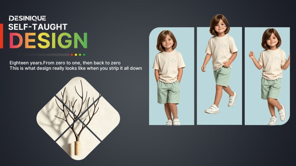
Hi, I'm Dsinique.
I’m a pragmatic designer with 18 years of self-taught experience and commercial design practice under my belt. Over nearly two decades in the trenches, I developed a no-nonsense system: the practical 1/3 method for Photoshop beginners.
I built this framework specifically for beginners with zero drawing skills who don't want to get bogged down in dense, confusing theory. It strips away all the unnecessary fluff and focuses purely on actionable, high-impact commercial design fundamentals.
If you're looking for fancy effects and complex synthesis, I'm not your pitch. But if you want to create practical, commercial designs using just 1/3 of the simplest tools—and build your ultimate survival skill—that's my specialty.
The core philosophy is simple:1/3 Tools = 100% Commercial Layouts
You master the vital third; real-world experience and aesthetic growth take care of the rest.
The Reality Behind an Aesthetic Cover: Why Pretty Doesn't Always Mean Practical
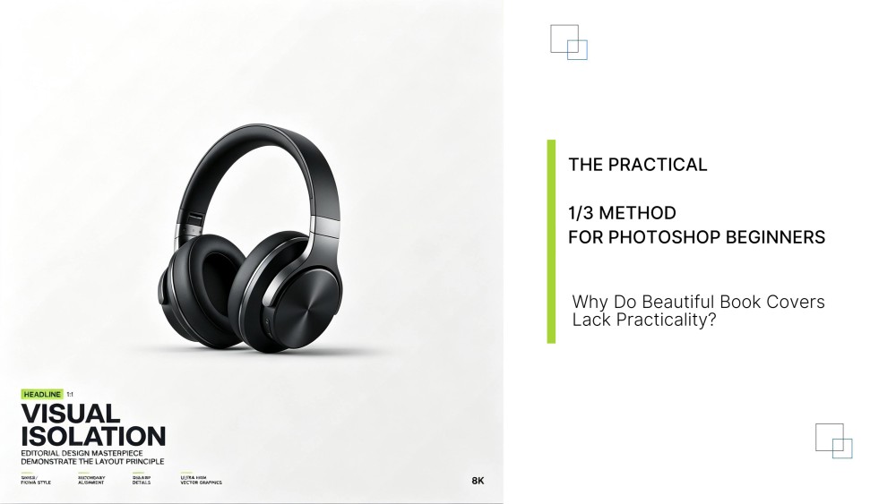
Take a look at this cover. To anyone just getting started in graphic design, it probably looks sophisticated and flawless. But when you test it against real-world commercial requirements, its shortcomings quickly come to light.
Weak Visual Impact: Too Muted to Stop the Scroll
At first glance, the layout seems unique. Yet, when evaluated against what managers, art directors, and paying clients actually approve, it is far too muted. It lacks a true focal point and fails to grab attention.
That kind of subtle, low-key look works fine in an art gallery, but it falls flat in the commercial arena.
In business, your graphic design needs to deliver its core message within 0.5 seconds. Contrast, saturation, and dynamic tonal range make or break that initial hook. This cover misses the mark on every single one.
Broken Typographic Hierarchy: Tiny Copy Becomes Visual Waste
Look at the lower-left copy block. The text hierarchy is completely washed out, and some micro-copy serves zero purpose beyond visual filler.
Real commercial graphic design has no room for filler. Every single phrase must be distilled down to its absolute essence.
Every line of typography must carry a purpose:
Anchor the brand name
Spotlight the primary value proposition
Drive a direct Call to Action (CTA)
Copy that conveys no actionable information is nothing more than visual noise.
Zero Separation Between Subject and Background: The Focal Point Is Lost
While the color palette feels cohesive, there is virtually no depth separating the main subject from the backdrop.
Effective advertising requires the hero asset—whether a product or a person—to pop off the canvas rather than melt into the scenery.
Look closely at top-performing e-commerce banners or social media ads. They all stick to a fundamental rule: keep the hero crystal clear, push the background back, and direct the viewer straight to the core offer.
This brings us to the essential Photoshop tools for poster design that self-taught designers often skip over. Using an adjustment layer like Levels or Curves to punch up tonal range, combined with a precise Layer Mask to isolate your subject, makes all the difference.
Muddy, Desaturated Tones: Missing Commercial Energy
Muted earth tones look great in fine-art photography. But for consumer goods, digital ads, and event posters, overly low saturation often reads as lifeless and unappealing.
Clients are not buying gallery art. They are investing in assets that stop passersby and digital scrollers in their tracks.
Anyone who has worked in-house or managed freelance clients knows the drill: clients want this element larger, that logo bigger, and every single asset they supply to command center stage. That is simply how business works.
Our job is to bridge that gap: satisfy the client's commercial goals while maintaining clean visual aesthetics, delivering commercial designs that are both striking and functional.
Popular