 Curator
2 September, 2026
Curator
2 September, 2026
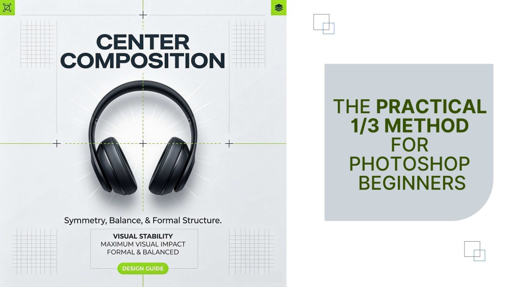
From Zero to Designer: The Practical 1/3 Method for Photoshop Beginners
Hi, I'm Dsinique.
I'm a self-taught designer who's been in this industry for 18 years, and I've developed a set of practical design principles along the way. At its core, this approach is exactly what I call a practical 1/3 method for Photoshop beginners—focus on just the 1/3 of tools that matter most, and you can handle the vast majority of commercial layouts out there.
Today, I'm distilling 18 years of hard-won experience into a single "pothole-avoidance + hands-on" guide. Whether you're a complete newbie trying to break into design or a working professional looking to level up, this is your cheat sheet. No fluff, just action.
1. 1/3 Tools = 90% Commercial Layouts
The first major trap I fell into: trying to learn everything.
Drawing from my own self-taught journey and all the mistakes I made along the way, I've put together a practical and unique learning framework. This system doesn't just help you overcome Photoshop tool anxiety—it also fast-tracks you to mastering the essential Photoshop tools for poster design and other real-world creative scenarios.
Weeks 1–4: Focus on the "Most-Used" Only
Photoshop: Prioritize Move Tool, Layers, Layer Masks, Rectangular Marquee Tool, and Curves for color adjustment. Learn one feature per day, then pair it with 10 minutes of hands-on practice. For example: after learning selections, cut out a photo of your family; after learning Curves, color-correct a flat-looking snapshot of your kid's artwork.
Illustrator: Focus on Pen Tool, Shape Builder, and Type Tool. Learn to trace simple shapes with the Pen, and combine basic forms into logo drafts using Shape Builder.
Theory Goal: Get a solid grip on "point, line, and plane" plus color fundamentals. Memorize the 6:3:1 color rule—60% dominant color, 30% secondary, 10% accent. Don't rely on gut instinct as a beginner; just grab ready-made palettes from sites like Coolors and run with them.
Weeks 5–8: Mimicry—From "Copying" to "Understanding the Logic"
Mimicry is the fastest way for a beginner to grow. This isn't plagiarism; it's studying how others handle layout, color, and typography.
Practice Method: Find 5 simple, high-quality commercial pieces (e.g., a bubble tea shop poster or a social media cover). Recreate them pixel by pixel. As you do, constantly ask yourself: Why this font for the headline? Why left-aligned instead of centered? Why these three specific colors?
Weeks 9–12: Building Your Portfolio
Your portfolio is your "foot in the door" as a new designer. Don't chase "high-end" for the sake of it—what matters is logic and authenticity. Here are three types of projects that work great for beginners:
1. Fictional Business Case: Design a full logo + menu + coupon set for a made-up bubble tea shop. This shows off your branding capabilities.
2. Real-Life Practical Design: Create a cover for your kid's study materials, or design an avatar and banner for your own social media channel. This demonstrates your ability to execute in real-world contexts—and it's also a perfect training ground for minimalist social media graphic design.
3. Redesign an Old Piece: Pick a past work you're not happy with and rework it using everything you've learned. This visually proves your growth trajectory.
Self-taught design has no shortcuts—it comes down to daily consistency and grinding through practice, one session at a time. That's all for today. I'll be back with more of my unique, practical learning methods. Stay tuned.
Popular