 Curator
4 September, 2026
Curator
4 September, 2026
practical 1/3 method for Photoshop beginners:Why Do Beautiful Book Covers Lack Practicality?
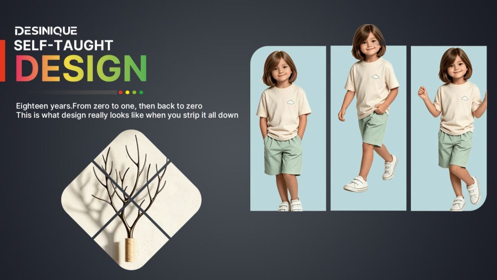
Hi, I'm Dsinique. I’m a pragmatic designer with 18 years of self-taught experience and commercial design practice under my belt. Over nearly two decades in the trenches, I developed a no-nonsense system: the practical 1/3 method for Photoshop beginners.
When you first open Photoshop, the sheer volume of tools, menus, and panels feels overwhelming. Most beginners quit before they even start. That is why I developed the practical 1/3 method for Photoshop beginners.
This framework is built on a simple rule: cut away 70% of the complicated filters and niche settings, focus entirely on the core tools that drive commercial value, and help you overcome Photoshop tool anxiety once and for all. Commercial design is never about showing off flashy techniques; it is about delivering messages clearly and efficiently.
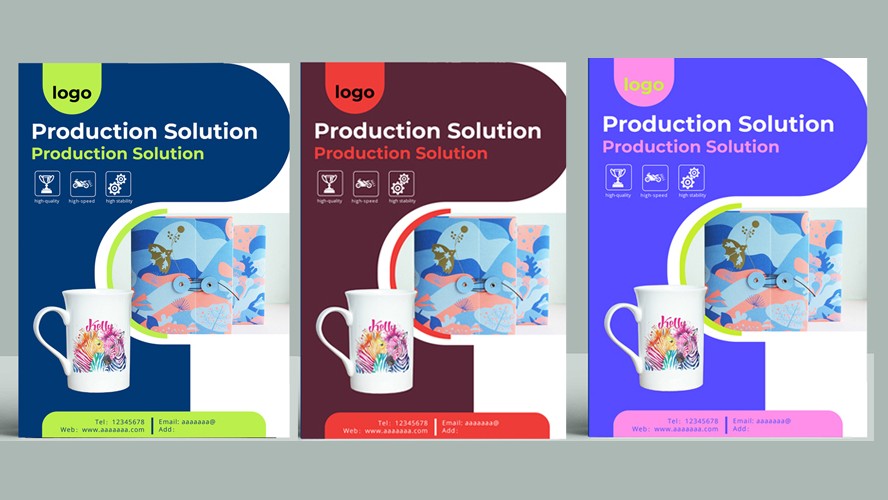
Layout Foundations: Mastering Decorative Color Blocks
Beginners often rush straight into complex photo manipulations and heavy filters. In real-world client work, your layout starts with understanding color blocks. A color block is far more than a splash of color; it acts as the structural skeleton of your composition, creates reading steps for the eye, and gives the layout room to breathe.
Common Types of Functional Color Blocks
Header Underlays: Instantly establish visual hierarchy and make your primary headline pop.
Decorative Dividers: Use the Rectangle Tool to draw clean lines that guide the reader’s eye across the canvas.
Geometric Framing: Build spatial depth using simple shapes to support your content.
Product Stage Blocks: Provide a clean, grounded base for product shots to elevate perceived value.
Negative Space Balancers: Preserve breathing room to keep the layout open and uncluttered.
The Two-Tier Logic for Using Color Blocks
Logical Layering: Move progressively from functional placement (defining information zones) to fine-tuning corner radii and opacity, and finally to geometric balance. This step-by-step approach gives your work an intentional, polished look.
Emotional Value: Color blocks are more than layout containers; they carry tone. By adjusting scale and value, you can project a clean corporate feel, an inviting warmth, or bold creative energy.
Once you master this logic, handling minimalist social media graphic design projects becomes second nature.
Visual Polish: The Subtle Details That Separate Pros from Amateurs
The line between amateur work and professional design always comes down to execution details. Dialing in a few essential Photoshop tools for poster design will immediately clean up your artwork:
Color Control: Stick to a clear hierarchy of dominant, secondary, and accent colors to avoid visual chaos.
Typography: Match your display and body typefaces intentionally. Dial in your tracking and leading, and rely on the Character panel to set distinct font weights that naturally organize information.
Alignment and Spacing: Use the Move Tool alongside the Align panel and smart guides to snap elements into place, eliminating sloppy visual friction.
Intentional Accents: Keep decorative shapes subtle. Every element must support the message rather than compete for attention.
Clean Iconography: Keep icon weights, styles, and dimensions uniform so they serve as effortless navigational cues.
/b>Color Application: Two Practical Rules for Flawless Palettes
Color theory can paralyze beginners, but real commercial projects only require two dependable methods:
Derive from Brand and Industry Identity
Tech and Corporate: Blue tones convey reliability, structure, and professional trust.
Eco and Wellness: Green tones communicate organic growth, calm, and sustainability.
Retail and Promotions: Red tones generate urgency, excitement, and high energy.
Sample Directly from Hero Images
When your layout features a primary photograph or product render, select the Eyedropper Tool and sample colors directly from the image. Apply those exact tones to your typography and background shapes. This creates instant, effortless harmony across the canvas.
Two Rules for Color Restraint
The Rule of Three: Limit your layout to no more than three distinct hues (excluding black, white, and neutral grays).
Shift Brightness and Saturation: Add a Hue/Saturation adjustment layer to create depth within a single color family by tweaking lightness and saturation rather than piling on extra colors.
Beyond the technical steps, design has simply been a practical, fulfilling path for me. At 42, I consider myself a straightforward person who simply committed to a reliable, self-taught craft.
For anyone who values a balanced life, steady income, and time for family, mastering practical graphic design is more than enough. You do not need every tool in the box. Focus on the vital third, master the fundamentals, and let clean execution do the heavy lifting.
Popular