 Curator
9 September, 2026
Curator
9 September, 2026
Practical 1/3 Method for Photoshop Beginners: 4 Steps to Pro Layout & Color
Most self-taught designers hit a wall when confronted by an intimidating workspace packed with endless toolbars. The common misconception is that professional output requires knowing every obscure feature. In reality, breaking through creative roadblocks comes down to a practical 1/3 method for photoshop beginners: mastering just the essential one-third of Photoshop’s core toolkit will effortlessly handle over 90% of real-world commercial layouts.
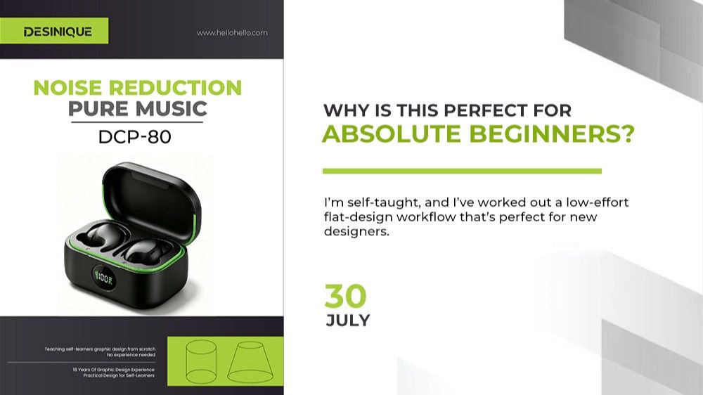
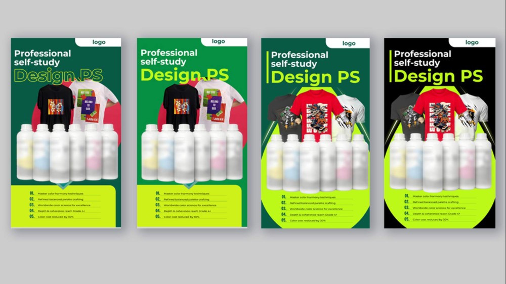
To truly overcome photoshop tool anxiety, focus your energy on foundational structural grids and intentional color restraint. Here is a breakdown of a commercial poster across four iterative stages, illustrating how simple tools drive professional design logic.
Draft 1: The Monochromatic Safe Zone
●Design Concept: Beginners often fear aggressive contrast, retreating to monochromatic palettes. This initial draft paired a deep green canvas with muted light-green information cards.
●Core Weakness: The headline used a delicate outline treatment, giving it zero visual weight. Without a decisive focal anchor, the typography failed to ground the composition, leaving the poster flat and lifeless.
Draft 2: Establishing a Dominant Visual Anchor
●The Iteration: Targeting the text layer, typography shifted to a bold, heavy weight inside the Character Panel, treated with a high-saturation accent tone for immediate readability.
●Core Weakness: The headline finally punched through, but the background relied on a basic circle slapped behind the subjects. The assets existed as isolated floating islands, lacking visual depth and organic flow.
Draft 3: Carving Perspective and Dynamic Tension
●The Iteration:
○Subject Realignment: Restructured the visual hierarchy so high-energy central elements commanded focus over secondary accents.
○Breaking the Frame: Replaced static enclosing shapes using the Polygon Tool alongside diagonal guides, creating an expanding perspective frame where elements overlapped edges to generate a true pop-out dimensional punch.
○Foundation Grid: Built a disciplined horizontal array across the lower quadrant, giving the eye a solid base that resolves reading flow from top to bottom.
●Core Weakness: Commercial energy and composition snapped into place, but aggressive green floods quickly induced visual fatigue over sustained viewing.
Draft 4 (Final): Balancing Neutrals with Vibrant Accents
●The Iteration: Swapped the heavy green background for a deep, pure black canvas, leaving vibrant green accents strictly along directional perspective edges.
●Design Rationale:
○Color Restraint: Black ground immediately tamed the high-saturation foreground elements, turning jarring vibrations into measured commercial confidence.
○Contrast Dynamic: Achromatic tones (black, white, and gray) provide ultimate visual balance. They let foreground subjects and array cards pop with clarity, carving out deep separation to deliver an authentic, minimalist social media graphic design finish.
Hands-on Toolkit: Producing Commercial Work with Just 1/3 of Photoshop
This entire poster transformation relied on zero exotic filters and zero complex layer masks. It was executed purely through these essential photoshop tools for poster design:
●Horizontal Type Tool (T) and Character Panel: Sculpt typographical hierarchy by managing font weight, tracking, and leading to establish an undeniable reading order.
●Pen Tool (P) and Shape Tools (U): Construct foundational vector geometry and angled color blocks to erect perspective skeletons.
●Align and Distribute Controls (Options Bar): Snap lower arrays and data lists into razor-sharp alignment with a single click, ensuring clean industrial precision.
●Layers Panel (F7):Organize clean group structures and layer stacking to orchestrate dimensional overlap.
Elevating your work from amateur to agency-grade is never about tool complexity. It hinges on managing structural balance, message priority, and controlled palettes. Stop burning hours memorizing every buried sub-menu. Master this essential one-third toolkit, and commercial-grade layouts become second nature.
Popular