 Curator
7 September, 2026
Curator
7 September, 2026
The Practical 1/3 Method for Photoshop Beginners: Fast Cover Color Design
Hi, I am desinique, a self-taught graphic designer. For beginners, tackling commercial layout is never about mastering every single setting. It is about locking in a lean, practical workflow so you can finish client-ready assets fast. Just this morning, an urgent six-page booklet landed on my desk. By sticking to my core methods without extra fluff, I delivered the final files by 2 PM. The cover build was the most exciting part of the entire run.
Here are three reliable color approaches mapped to real-world cover layouts.
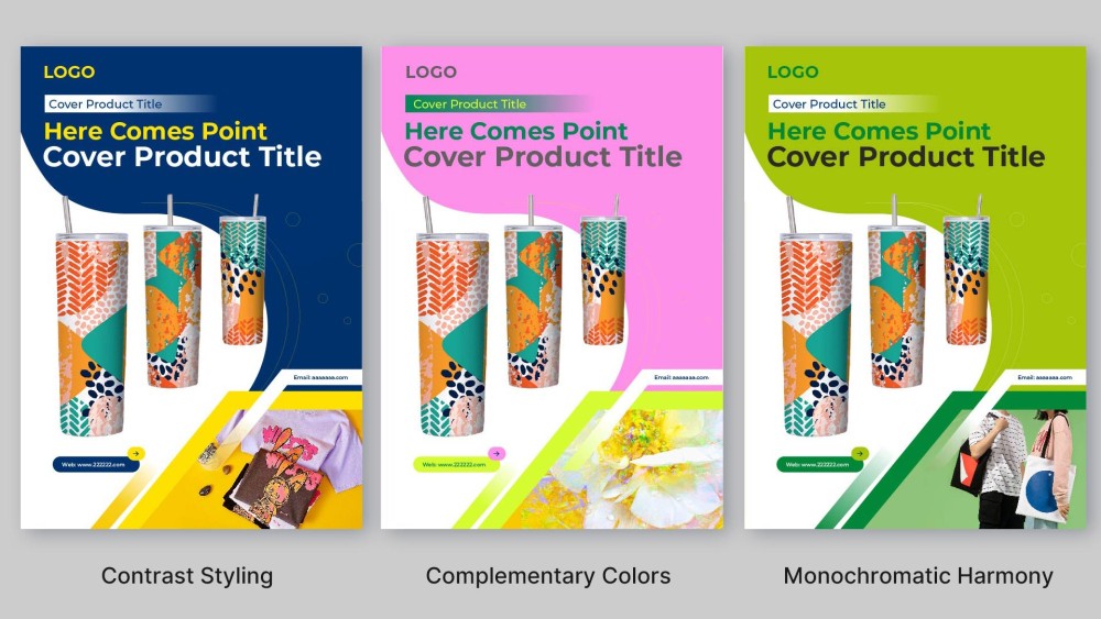
Contrast Styling
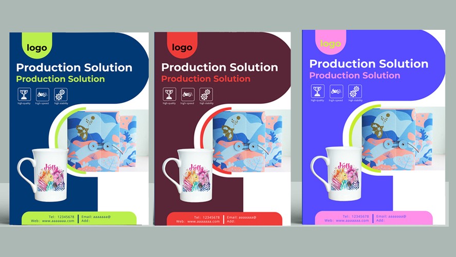
This layout relies on aggressive tonal contrast rather than opposite wheel placements alone. A rich navy background establishes an authoritative, grounded foundation, while high-value bright yellow headlines instantly cut through the darker base. In commercial cover work, this wide value gap locks in a clear focal point right away. It delivers high-impact clarity for event brochures, social banners, and commercial decks that need instant shelf presence.
Complementary Colors
This spread applies classic red-and-green complementary logic from the traditional color wheel. Instead of using harsh neon primaries, the canvas pairs a high-brightness pastel pink backdrop with deep forest green headlines. Softening the red into pink removes the jarring vibration often seen in complementary pairs. You get high visual distinction with a balanced, editorial feel that keeps key text prominent without fatiguing the eye.
Monochromatic Harmony
This direction stays entirely within the green family, building depth through value and saturation shifts. The luminous lime ground brings fresh energy, while low-brightness dark green and charcoal text anchor the layout and preserve readability. Because there are no competing hues, the composition feels clean, unified, and intentional. It works especially well for corporate overviews and brand publications that require an understated, modern aesthetic.
If you're looking for fancy effects and complex synthesis, I'm not your pitch. But if you want to create practical, commercial designs using just 1/3 of the simplest tools—and build your ultimate survival skill—that's my specialty
Popular