 Curator
8 September, 2026
Curator
8 September, 2026
Practical 1/3 Method for Photoshop Beginners: Master 90% of Commercial Label Layouts
For beginner designers, designing product labels is easily one of the most frustrating assignments. In a space no bigger than the palm of your hand, you must keep things ultra-clean while still delivering maximum visual punch. Tackling a label once or twice feels manageable, but churn them out day after day and creative burnout is inevitable. Unlike posters, a label leaves zero room to hide behind trendy color splashes, complex shapes, or busy textured backgrounds—every single millimeter exists purely for functionality.
Breaking through this creative wall comes down to adopting a practical 1/3 method for photoshop beginners: mastering just the core one-third of Photoshop’s workspace to build over 90% of production-ready commercial designs (1/3 Tools = 90% Commercial Layouts).
Design Breakdown: Anatomy of an Industrial Label
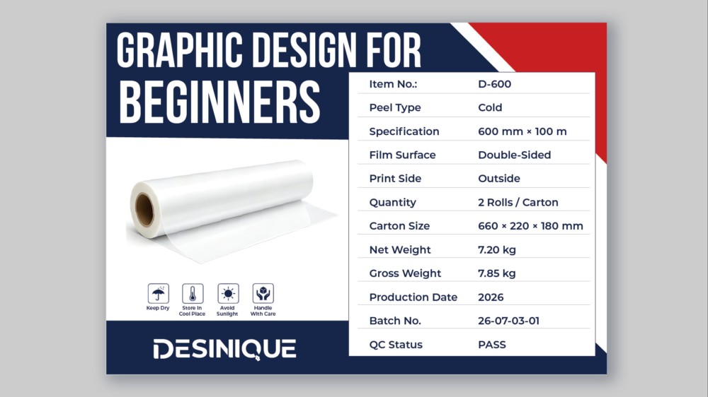
Take a close look at the label layout above. You will not find heavy layer styles or complicated filters here; the entire piece commands attention through strict visual discipline:
●Navy Anchor with an Angular Crimson Accent: A deep navy header grounds the canvas, while a sharp diagonal slice of pure red in the upper corner shatters the rigidity of a standard rectangle, instantly carving out a brand focal point.
●Bold Left Column and Product Visuals: High-impact, condensed uppercase type anchors the left column, flowing effortlessly into the 3D product render and the DESINIQUE brand mark below.
●Grid-Aligned Specification Table: To tame the dense wall of technical parameters, skip decorative flourishes. Hairline light-gray rules group each entry into clean data rows, while property labels and values snap to flush-left and flush-right margins for effortless readability.
●Micro Storage Icons: Standardized icons for handling, dry storage, and sunlight protection tuck neatly into the lower zone, injecting instant industrial credibility without stealing valuable layout real estate.
Zero Fluff: How to Execute This Using Only 1/3 of Your Toolkit
To truly overcome photoshop tool anxiety, forget about drowning in advanced masking or niche filters. You can execute clean, professional labels with just these essential photoshop tools for poster design:
1.Pen Tool (P) and Rectangle Tool (U): Carve out the asymmetric navy base and the angular red corner tab, establishing a sharp, technical frame with elementary vector geometry.
2.Horizontal Type Tool (T) and Character Panel: Tighten the tracking on your display title to build visual tension, then set uniform leading across the right data column to achieve an authentic, minimalist social media graphic design aesthetic that prints flawlessly.
3.Align and Distribute Controls (Options Bar): Select all type and divider line layers, then click Distribute Vertical Centers and Align Left/Right. This eliminates tedious manual nudging and instantly locks your grid into place.
Whenever you hit a creative wall on label work, stop hunting for more assets. Focus on this essential one-third of your toolkit, nail your alignment, balance your geometric blocks, and even the tightest industrial layout will radiate high-end craft.
Popular