 Curator
21 September, 2026
Curator
21 September, 2026
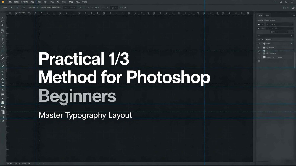
Practical 1/3 Method for Photoshop Beginners: Master Typography Layout
Staring at a crowded Photoshop toolbar often triggers instant photoshop tool anxiety, leaving beginners with the false impression that high-end typography requires endless font varieties and complex tricks. In reality, that approach only creates cluttered, amateurish visuals. The real secret to commercial-grade layouts lies in our practical 1/3 method for photoshop beginners: zeroing in on the top one-third of core tools and foundational design principles to build sleek, elevated layouts using clean, intentional logic.
Mistake 1: Font Overload and Fragmented Visual Hierarchy
A frequent beginner trap is assuming that cramming more fonts into a canvas makes it look more creative. In practice, stacking a condensed sans-serif title over a vintage serif italic, and then dropping in a rounded body font, completely shatters visual continuity. The conflicting styles clash, leaving the reader with a disjointed reading flow.
The Strategic Fix:
• Set a strict two-font limit: Cap your layout at a maximum of two typefaces, keeping a distinct boundary between your primary display type and your supporting text.
• Rely on one versatile typeface: Choose an established sans-serif family with a deep range of weights, such as Inter, Roboto, or Montserrat. Pairing Thin, Regular, and Bold weights within a single family establishes an effortless visual hierarchy, serving as a core shortcut for minimalist social media graphic design.
Mistake 2: Missing Contrast and Competing Focal Points
Another routine typography pitfall is keeping font sizes and weights too similar across the page. When headlines, body text, and footnotes share roughly the same visual footprint, they shout over each other, making it impossible for viewers to lock onto the core message in the first three seconds.
The Strategic Fix:
• Push extreme scale and weight differences: If two blocks of text serve different functions, push them to opposite ends of the spectrum. Pair an oversized, bold headline with compact, light body copy to create immediate visual tension.
• Lock into a strict alignment line: Pick a single reference line, like a disciplined left alignment, and snap your headlines, body copy, and bullet points right to that edge to anchor the entire framework.
Master the Type Tool alongside the Character panel from your essential photoshop tools for poster design to control font scale and leading, commit to strict alignment, and give your layout ample negative space. That simple discipline will instantly strip away that raw beginner feel and deliver polished, commercial-grade results.
Popular