 Curator
10 September, 2026
Curator
10 September, 2026
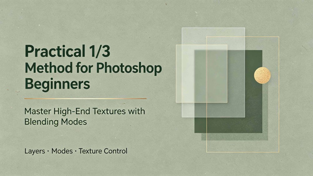
Practical 1/3 Method for Photoshop Beginners: Master High-End Textures with Blending Modes
When you first open Photoshop, crowded panels and endless menus easily trigger tool paralysis. The practical 1/3 method for photoshop beginners cuts through the noise by stripping away 70% of unnecessary features, letting you master the vital one-third of core tools that actually drive results.
Hey everyone, I am Desinique, a self-taught designer. Today, we are zeroing in on one of the most impactful essential photoshop tools for poster design: Blending Modes. Mastering this feature will not only help you overcome photoshop tool anxiety, but also allow you to build clean, atmospheric visuals for minimalist social media graphic design without relying on complex color grading.
Blending Modes: Instant Mood and Lighting
Skip tedious color grading workflows. Blending Modes let you dial in realistic lighting and rich textures in seconds.
The Top 3 Universal Modes for Beginners (Handles 90% of Scenarios):
Multiply: Darkens your artwork, casts natural shadows, and blends textures. It is your ultimate shortcut to knock out white backgrounds.
Screen: Brightens the canvas, produces specular highlights, light beams, and glowing effects. The go-to method to drop out pure black backgrounds.
Overlay / Soft Light: Boosts overall contrast and enriches texture, instantly making flat graphics look crisp and dynamic.
Virtually every high-end commercial poster relies on the exact same workflow: Solid Color Fill Layers paired with Blending Modes and Layer Masks.
Layer Opacity: Master Visual Weight and Hierarchy
Messy, harsh, and cheap-looking graphics usually stem from one rookie mistake: pushing every element to full saturation and 100% Opacity.
Professional Hierarchy and Visual Rhythm:
Primary Subject: Opacity at 100% to command immediate focus.
Supporting Information: Opacity at 70%–80% to step back and support readability.
Background Accents: Opacity at 20%–50% to build subtle depth without stealing attention.
Visual hierarchy comes down to intentional contrast: balancing light against dark, sharp elements against soft textures.
The Takeaway
Real-world commercial design does not require memorizing every single button in Photoshop. Stick to this practical 1/3 method for photoshop beginners: set your mood with Multiply, Screen, and Overlay, then refine your visual depth with Opacity. A disciplined, minimal toolset is all you need to deliver clean, modern, client-ready work.
Popular